Monochromatic Atmospheric Perspective
For this project, we began with learning about the colour values, and learning about the value scale.
True Hue- the colour as it is
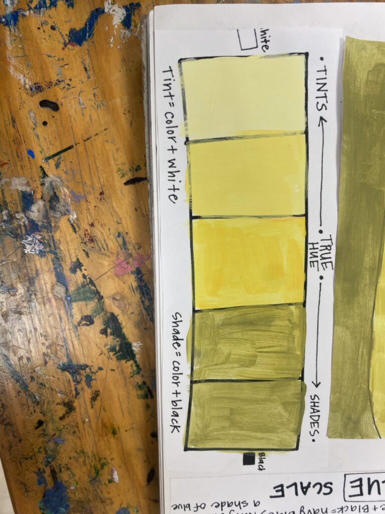
Tints- adding white to your true hue
Shades- adding black to your true hue
We started with making our colour scale; I chose the colour yellow! (It’s my favourite colour so I had to).
We made our scale, heres mine:
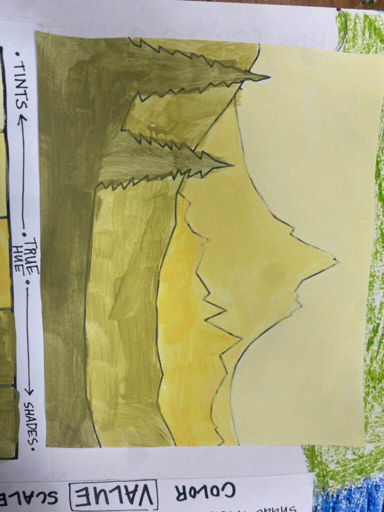
Then, we made our mountain example, heres mine:
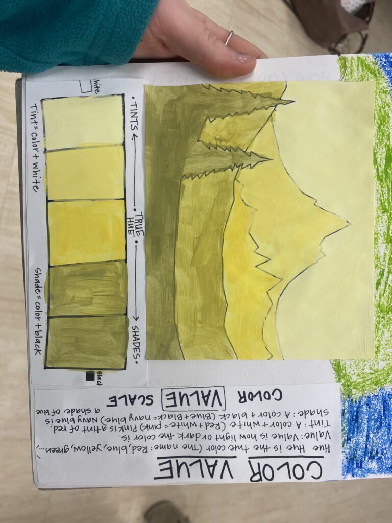
Here it is all together with the notes and information to help me remember what is what:
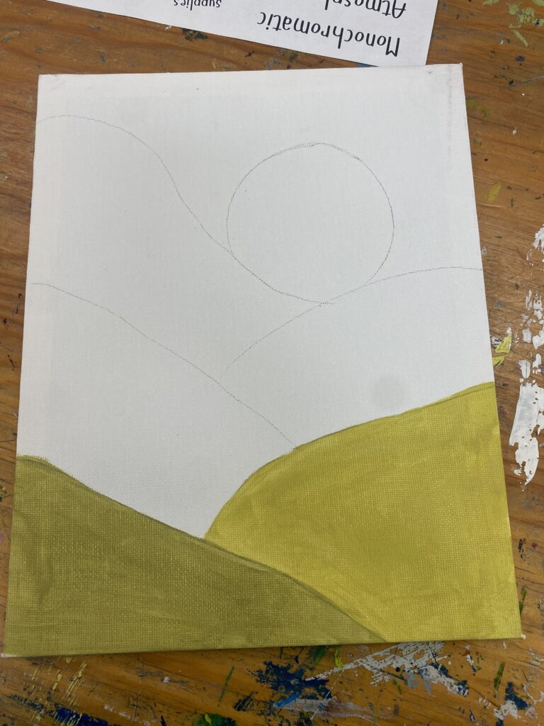
Once this was done, we got to begin our final project. We began by outlining our different shades/tints I did 6 sections. I began by doing my shades (the darker colours):
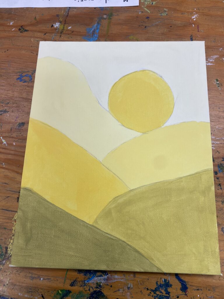
I then added my hue and my tints! I decided that I wanted to paint my sun the same as my hue colour because I felt it would stand out more! I am really happy with how it looks! Here is my final project:
Assessment:
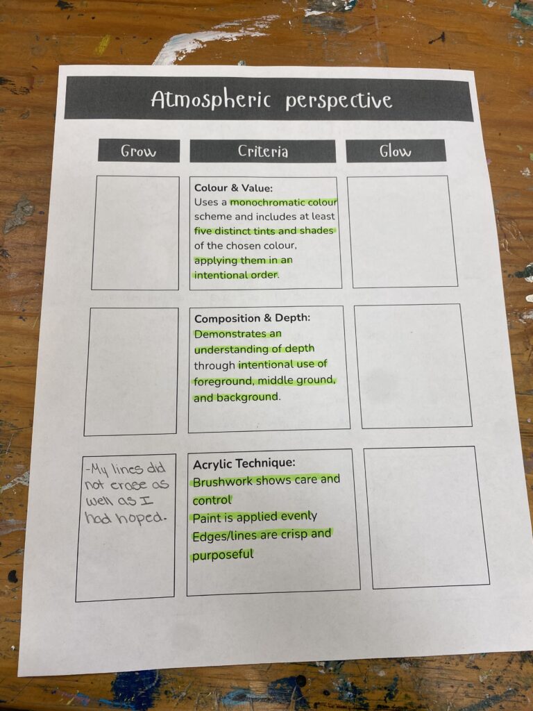
I think I did a pretty good job on this project, I completed all of the requirements, however I feel something I could do better on next time, is when drawing my outlines with my pencil, drawing them a bit lighter so they are easier to erase, because on my final project, the lines are very distinct and I am not suuuuper happy with that. Here is my self-assessment:
Artist Statement:
I found that thinking about this project stressed me out more than doing the project itself. I find that I struggle a lot with mixing colours to get different shades and tints, so thinking about having to do this was hard for me. But once I got started, I found that it wasn’t really that hard. I got a bit nervous when my shades looked more green than they did yellow, but I actually love the way the colours turned out!
Overall I tried to do an easier design because I didn’t want to stress myself out more with my design. I chose to do simple hills with a nice big sun. I love the way the colours look together and I am very happy with my final project. I love the way the illusion of depth in the landscape looks!